HACC-Hui
Every year, the Hawaii Annual Code Challenge is held to bring like-minded creative individuals to team up and tackle a challenge by creating innovative web applications. However, as 2020 brings us rather difficult circumstances, team formation needed to be transformed to become completely digital, in contrast to meeting teammates face-to-face. This year, our class in ICS 414 created HACC-Hui to tackle the limitations of the pandemic and provide easy team creation from the comfort of your own home. Not only does it help students connect and join teams remotely, HACC-Hui offers a variety of options to assist in finding teams that share the same interests or finding participants that would perfectly match one’s team. For just developing this app in a semester, we were successful in creating a product that helped make the HACC’s team formation experience easier.
Functionality
For this project, our class was split into teams of four to five students to work on each stage of production or “milestone.” During each milestone, each student was given a list of user stories that consisted of the ideas the customers wanted for HACC-Hui. Each user story explained the different key features that our app would have, such as adding admin functionality, team development, user profile development, etc. At the end of each milestone, each team presents their ideas to discern which idea would be used for the end product.
Milestone 1
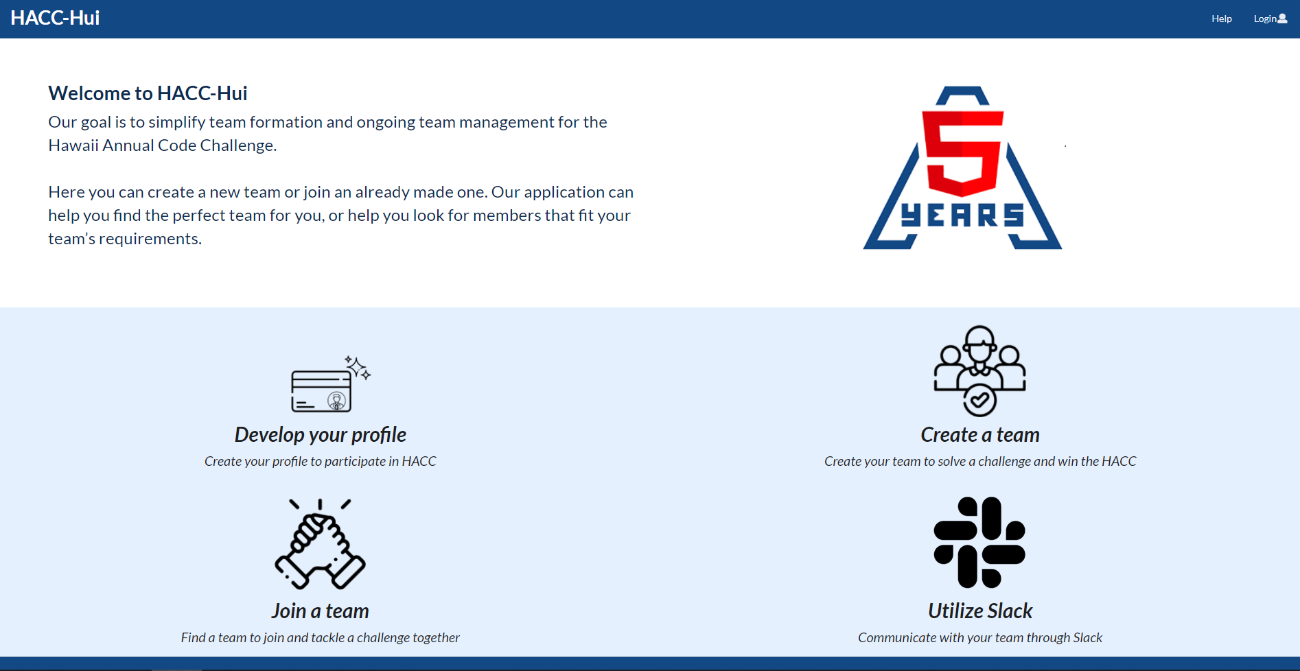
In Milestone one, I was tasked to create the Landing Page. I had little to no experience with UI design, but it was still enjoyable nonetheless! My vision for the landing page was to have a minimalist, clean feel that would not clutter the participants with too much information. I added the four mini descriptions at the foot of the page to give a brief summary of what our app is capable of providing for its users, along with vector icons at each key point: developing a profile, creating a team, joining a team, and utilizing Slack.
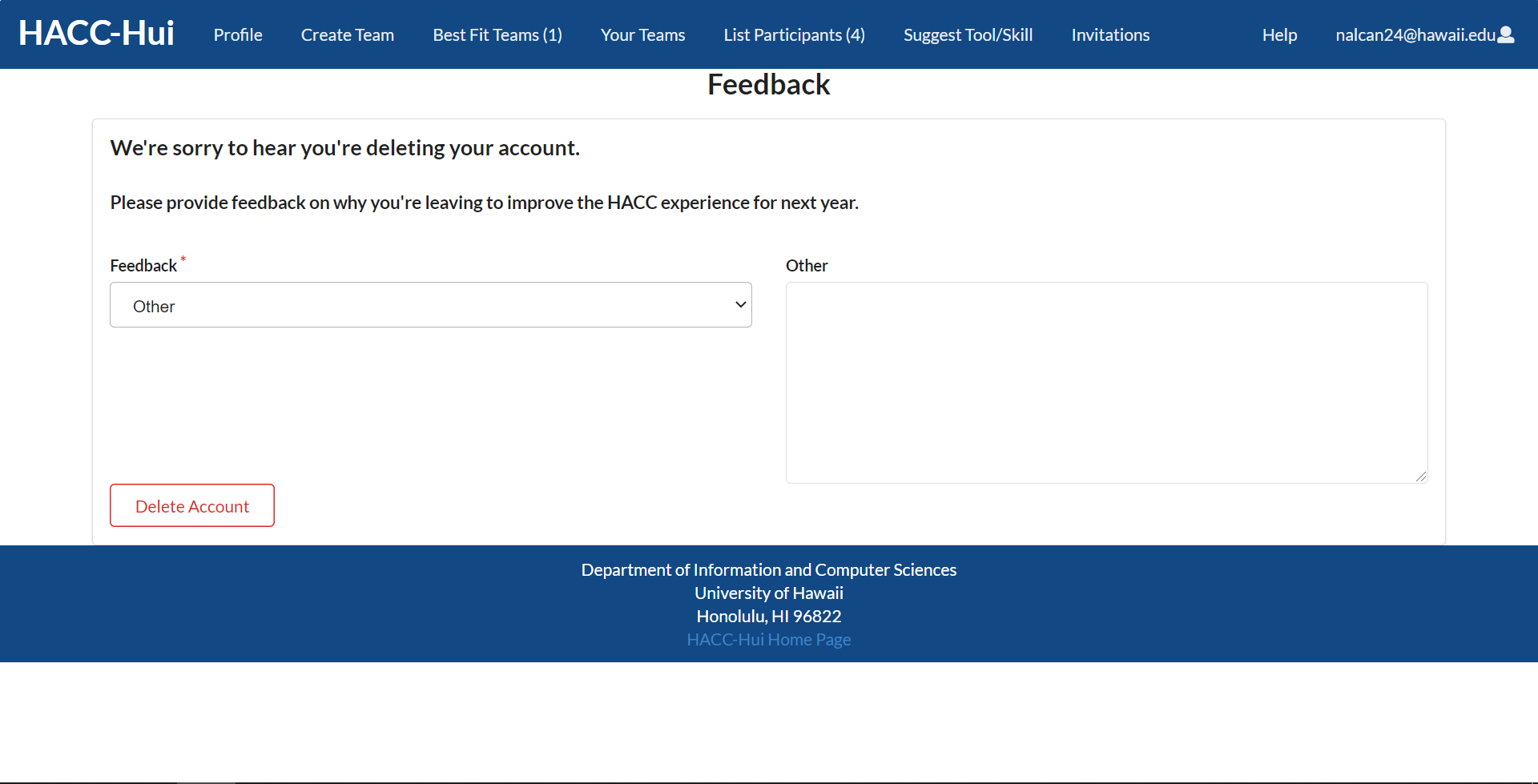
I also contributed by creating the Delete Page. When clicking the user icon on the upper right corner of the app, the user may select the option to delete their account. Doing so will bring them a feedback page that inquires the user for their reason for deleting their account. This was created with the simple Semantic UI dropdown to create the options and adding the selected option to the schema which would be submitted. Upon clicking the delete button, there will be a confirmation message, to make sure the user definitely wants to delete their account. To delete a user account, I implemented a Meteor method in the API, which would delete the Meteor account associated with the user. Additionally, the user from the Participant collection would be deleted as well. This way, when the user decides to reapply for HACC for any reason, they will be able to create a new account with a new user ID.
Milestone 2
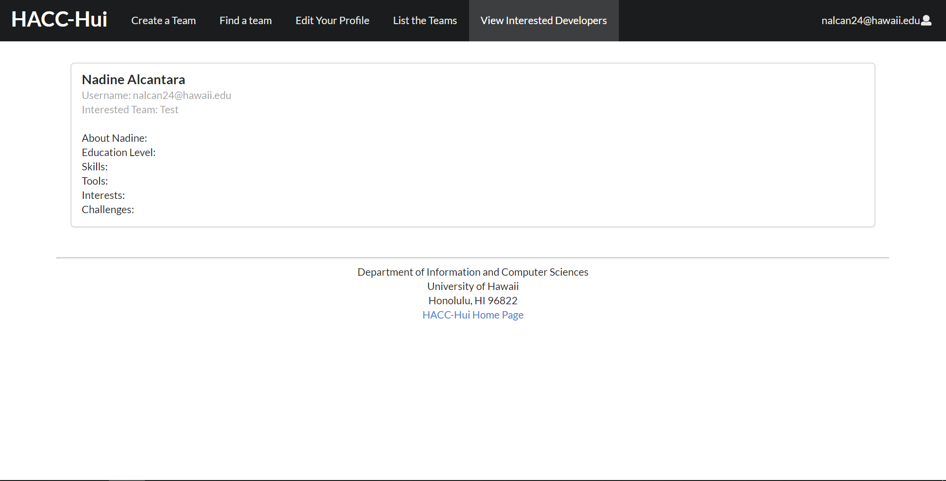
In Milestone two, I added functionality that will let the participant indicate a team they are interested in joining. In the list team page, I added a “Request to Join” button to the side of each displayed team. Clicking it will send a Slack DM to the receiving team, as well as adding the user to the WantsToJoin collection for easy referencing. I also created an Interested Developers page that would display all the developers that have shown interest in a user’s team. Since I was still learning about using MongoDB’s Collections, it was difficult for me to map the user’s attributes onto each display card. Nonetheless, I was still able to allow each profile to display the name, username for Slack purposes, and the corresponding interested team.
Milestone 3 – “The Final Sprint”
As the deadline for the final product grew nearer, our workflow for the project changed as switched gears and began individual work. We were able to freely select any project issue to work on to push through the final days of development. As for me, I worked on fine tuning the app to give it more uniformity. I changed the Delete Form page to follow the widget convention as it handles both subscriptions and getting data. I also allowed many pages to be mobile friendly, such as the Best Fit Teams page, List Teams page, Profile page, and Team Membership page. Doing so greatly improved the user experience on multiple devices.
Team process
I was in a team, LevelUpTeamA, working with my classmates Angeli Amascual, Newton Ransfer, Christine Uehara, and Justin Wong. We had a collaborative workflow that utilized GitHub’s Kanban board to organize all the project issues into Milestones. To ensure that we were on top of all deadlines, we put together all of our class schedules to find times during the week to meet and discuss our plans for the projects. We usually held short meetings through Discord at least once or twice a week to check up on progress and hold run-throughs for upcoming presentations to guarantee that our repository was sufficient. Since we all use Discord outside of class, availability was not a problem and we were all open for communication at all times, so we were also able to help each other on issues at any time.
To split the work evenly, we each assigned ourselves one to two issues that we felt were manageable to complete in two weeks. As mentioned before, I mainly worked on base UI scheme for the app, the Delete Form page, and the Interested Developers page. As my other team members were able to contribute on the rest of the issues, I would say that our organization went well. Considering this is the first time we are working together completely online, we have made good progress with our existing resources.
Takeaways
ICS 414 was an interesting experience for me this semester. While it did retain similar aspects from ICS 314 like working in teams and communicating through online messaging, ICS 414 had an upscale in difficulty. We had to utilize a new API with Meteor Collections, making it was a big learning curve for most of us and was certainly a struggle for some. Our class was completely taught through Discord, confusing me at first on why we were not using Slack like the previous class, but I slowly gotten acquainted with after a few days. I use Discord daily for regular communication so using this platform for class greatly boosted my participation in team conversations. The utilization of the voice and text channels made organization easier as well.
As this class had such a large learning curve, it was challenging for me to grasp the new tools and skills while trying to meet deadlines for each milestone. I felt overwhelmed a few times, constantly running into new obstacles that I have not encountered before in my prior experiences, but I strived to push forward while also building my skills on web app development. Though time was short towards the end of the semester as we switched from the Milestones to the Final Sprint, I was able to adapt to the new situation and
You can find the running app here, the GitHub repo for our group LevelUpTeamA, the repo for HACC-Hui, and further documentation


